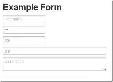
http://www.zurb.com/playground/inline-form-labels?
The CSS for Inline Labels
We won’t touch on the CSS to create the inputs above – how you style your form elements is entirely up to you. What we’re concerned with is how to do the inline label without making structural changes, and how to do the cool fading transitions (you see in Safari 4). There are a few key CSS lines that give us the positioning and effects we want.
input.input-text {position: relative;z-index: 2;}label {position: relative;z-index: 1;}
In order for the effect to work we need to insure that the label falls behind the input. We need position: relative in order for the z-index to take effect.
This makes no difference for the standard display, but makes the inline label possible.
label.inlined {padding-left: 6px;font-weight: normal;font-size: 12px;font-family: "Helvetica Neue";opacity: 0.75;-webkit-transition: opacity 0.15s linear;}
For our inlined label we need to move it right a bit and override the label text styling to match the input field. The real magic here is with the -webkit-transitionproperty.
The syntax here tells the browser that when the opacityproperty changes, animate the changes over a 0.15s window and use a linear animation (as opposed to ease-in or ease-out).
label.inlined + input.input-text {margin-top: -22px;}
And now the coup de grace. There are two tricks at work here, the first in the selector and the second in margining.
label.inlined + input.input-text tells the browser to apply properties to any input.input-text that is preceded (on a sibling level) by a label.inlined element.
Negative margining essentially moves the input up in front of the label (your label background will need to be transparent for this). Done and done.
And a Little Bit of Javascript
In order for the label to fade and then disappear we need to apply classes at particular times. We’ll use jQuery in this example, but the principle is the same for Prototype or straight JS.
label.focus { opacity: 0.35; }label.has-text { opacity: 0.0; -webkit-transition-duration: 0s; }
Okay we lied, there’s a little more CSS. These two classes will be applied when the input gains focus, and when the input receives text.
The extra -webkit-transition here means that when the user starts typing the label will instantly vanish, rather than fading off.
$(document).ready(function(){$("label.inlined + input.input-text").each(function (type) {Event.observe(window, 'load', function () {setTimeout(function(){if (!input.value.empty()) {input.previous().addClassName('has-text');}}, 200);});$(this).focus(function () {$(this).prev("label.inlined").addClass("focus");});$(this).keypress(function () {$(this).prev("label.inlined").addClass("has-text").removeClass("focus");});$(this).blur(function () {if($(this).val() == "") {$(this).prev("label.inlined").removeClass("has-text").removeClass("focus");}});});});
This is the javascript we need to selectively change classes on the label. There are four functions:
- The first is an observer that helps us out with autocompletion – we detect if the browser filled in the text, and then clear the label.
- When the input gains focus, move up to the label and apply the
focusclass. - When the user starts typing, apply the
has-textclass. - When the user shifts out of the field, check if it’s empty: if so, remove the
has-textclass so the label will fade back in.
Copyright ZURB, freely available for distribution under the MIT license.
